Page 3 of 7
Re: Kit Design Ideas - WE NEED YOU!!!!
Posted: Sat Nov 25, 2017 3:46 pm
by wonger
+1 for Isla’s design.
Re: Kit Design Ideas - WE NEED YOU!!!!
Posted: Sat Nov 25, 2017 4:33 pm
by Roland
What about?

Re: Kit Design Ideas - WE NEED YOU!!!!
Posted: Sat Nov 25, 2017 5:31 pm
by Alan
Is that Pete Lawless's head in the pocket? Gotta rock with that one.
And those three things? What are they? Coffee Beans? Haemorrhoids? hard to say....
Re: Kit Design Ideas - WE NEED YOU!!!!
Posted: Sat Nov 25, 2017 5:52 pm
by barton bourassa
I like Leftcoaster's design also. Rolf's first is cool but maybe get rid of the teal for baby blue??!!
By the way, this is our kit, our design. It is cool that Neil is coming up with a design but I really do hope it is just one of a few designs that will be presented to the club for consideration. Whatever is chosen it is very important to me that the decision is made by us the people, I mean members!
Barton.
Re: Kit Design Ideas - WE NEED YOU!!!!
Posted: Sat Nov 25, 2017 9:02 pm
by norman marcy
KevinL
you are brilliant, as is your design. Take a bow.
To address leftcoasters constructive critique, take out the mid back black bar leaving a wider pink and wider blue bit and then add, as you suggest already in your post, the black and grey argil of the current kit shorts and that is a very handsome kit. works for everyone. Old school pink and blue way back to the first kit with the yellow at the neck and visible and not like all the other kits in town that pretty much blend together

well done
Re: Kit Design Ideas - WE NEED YOU!!!!
Posted: Sat Nov 25, 2017 11:19 pm
by Fozzy
Barton. I'm pretty disappointed and insulted that you'd think I'd run roughshod with the new kit design after asking the membership for design ideas. The process is that all submissions will be considered by a small kit committee with the favourite 2 or 3 going to the vote of the membership, cos after all the most important person in the club is everyone else or have you forgotten that?
Re: Kit Design Ideas - WE NEED YOU!!!!
Posted: Sun Nov 26, 2017 11:07 pm
by LouiseF
I am in need of a little "light distraction," so here I am. Perhaps it is a male/female thing but I need to counter Norm's impression if this is going to be voted on by a small committee who might be influenced by opinions expressed on this thread. No offense Kevin but your design(s) are angular and very square? I just can't think of another way to put it. I don't think you and I would have much fun clothes shopping together.

Re: Kit Design Ideas - WE NEED YOU!!!!
Posted: Mon Nov 27, 2017 12:55 pm
by JohnT
+1 for orca
Re: Kit Design Ideas - WE NEED YOU!!!!
Posted: Mon Nov 27, 2017 2:42 pm
by Fozzy
I have a few more to add to the mix and to keep it transparent. This is Isla Walkers kit design completed in the Champion Systems design system
Re: Kit Design Ideas - WE NEED YOU!!!!
Posted: Mon Nov 27, 2017 2:45 pm
by Fozzy
This is the design by Geoff Wong again done in the champions system design page.
Re: Kit Design Ideas - WE NEED YOU!!!!
Posted: Mon Nov 27, 2017 2:47 pm
by Ann
I
love the dots and the design but I am not a fan of orange
at all. (And yes, I have an orange cross bike, but would rather have any other colour.

)
Can we try this design with something other than orange?
Re: Kit Design Ideas - WE NEED YOU!!!!
Posted: Mon Nov 27, 2017 2:47 pm
by Fozzy
Re: Kit Design Ideas - WE NEED YOU!!!!
Posted: Mon Nov 27, 2017 2:48 pm
by Ann
Ann wrote:I
love the dots and the design but I am not a fan of orange
at all. (And yes, I have an orange cross bike, but would rather have any other colour.

)
Can we try this design with something other than orange?
I was replying about Isla's design but Neil's post of Geoff's design came in before my reply.

Interestingly, I don't mind the orange as much when it's limited to small sections of the jersey/shorts. I do like Geoff's design as-is.
Re: Kit Design Ideas - WE NEED YOU!!!!
Posted: Mon Nov 27, 2017 2:50 pm
by Ann
Fozzy wrote:Here is mine
TS Jersey - Neil Front.jpg
TS Skinsuit - Neil Front.jpg
TS Jersey - Neil Back.jpg
Whoa, that's a lot of orange, Neil!

And again, it's too much orange for me. But I love the design and would love to see it with something other than orange.
Re: Kit Design Ideas - WE NEED YOU!!!!
Posted: Mon Nov 27, 2017 3:26 pm
by Fozzy
Re: Kit Design Ideas - WE NEED YOU!!!!
Posted: Mon Nov 27, 2017 3:34 pm
by Ann
Fozzy wrote:Pink any good??
I like it but I'm not sure that everyone will. But that's probably true for anything we come up with.

Re: Kit Design Ideas - WE NEED YOU!!!!
Posted: Mon Nov 27, 2017 4:03 pm
by John D
Of all the options on offer so far, I have to say that I really like Neil's design (the orange option) the most.
I'm on record as saying that I don't really give a fiddler's fart what our kit looks like. As Rolf pointed out, it's the amazing people that make Tripleshot what it is, not the kit. That said, Neil's design also hits all the key elements that were raised when the topic was discussed at the AGM: a nod to the kit's argyle heritage, some baby blue, a coffee theme, and a high-vis colour pallette.
J.
Re: Kit Design Ideas - WE NEED YOU!!!!
Posted: Mon Nov 27, 2017 4:12 pm
by Bosie
Like John, I don't really care what we wear. I like Fozzys design, but the colour scheme reminds me of the old South African Flag which doesn't fill me with warm fuzzy feelings.
I took a stab at the design thingy. Came up with this, but am not clever enough to figure out the cool checks and coffee cups.
PS: love the Peacock and Raccoon one of Rolfs, would just have to get Alan off the back...
Re: Kit Design Ideas - WE NEED YOU!!!!
Posted: Mon Nov 27, 2017 4:13 pm
by Rolf
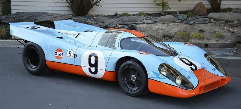
Correct me if I'm wrong, but Wonger's design is a direct reference to one of the coolest, most fire-breathing Porsches ever to win Le Mans:

And it's probably no fluke that it would beautifully match one of Wonger's bikes. (Gotta respect consistency!)
Other comments on that one:
- We've already got a nice palette of TS colours. I'm not averse to adding new ones, but I'm with Ann: I'm not much for this hue of orange. I do like the argyle effect on the shoulders.
- The stretched letters look verrrry similar to a recent Wheelers kit. That's not necessarily a bad thing; it just seems unnecessarily derivative.
- I've already said my piece on including the word "Cycling" on a lycra cycling jersey—a jersey that will virtually always be worn with full cycling gear and a helmet, and very likely in proximity to an actual bicycle...

- I really like the argyle with coffee cups on the dark background. It's subtle in both appearance and quirkiness.
- I like the coffee cup logo on the sleeves, but I'm not a fan of "3S"; it takes a moment to interpret as I first read it as "threes". I'd suggest "TS" is a more accessible abbreviation for the club.
Re: Kit Design Ideas - WE NEED YOU!!!!
Posted: Mon Nov 27, 2017 4:39 pm
by Rolf
As for Neil's pink one, it's definitely hitting some markers, but the hot, hot neon pink is too much of an assault on the eyes for me. I know this is carte blanche and we're not stuck with past colours, but Tripleshot Pink worked partly because it's much paler and gentler.
In a sport that has suffered a lot in the past from too much testosterone, the TS easter egg kit worked because it was pretty hard to act tough and be a jerk wearing it—or at least it repelled the type of insecure males who can make road cycling culture intimidating to join (with their mirrored sunglasses and unsmiling visage.) Some self-deprecation or conveying a sense of humour or irony can go a long way. Above all else, we want our kit to welcome everyone.
Provided you are viewing this forum on an Internet Explorer or Chrome browser, the little favicon up next to the URL for this page should be a bit of Tripleshot Pink argyle. It's also in the forum header, immediately under the Tripleshot Cycling script, alongside the bilious yellow/green and fæcal brown that also festooned the easter eggs. It's not a fluke that this became the identifiable visual identity of our Club.
Neil: is leaving the club name off the back of your, Geoff's and Isla's designs intentional? Also: will there be sponsor names on this new kit? Or does the club now get sufficient funding from elsewhere that we no longer need to be walking (riding) ads?
Thanks to everyone who continues to put effort into this. It's fun!

)
