Kit Design Ideas - WE NEED YOU!!!!
Moderator: mfarnham
Kit Design Ideas - WE NEED YOU!!!!
Hi All
I have been working on some designs for the new kit and would also like some creative input from the rest of the membership.
Please bear in mind that there are 3 important criteria to consider:
1. It has to have some continuity from the current kit;
2. It has to have bold colours so we will be noticed by other road users;
3. The front has to be darker for ease of cleaning.
So get your crayons out and submit your designs or ideas on here by the end of Nov, and all will be considered.
Cheers
Neil
Cheers
Re: Kit Design Ideas - WE NEED YOU!!!!
I have so many good ideas:


compete: 1620, from Fr. compéter "be in rivalry with"
- leftcoaster
- Posts: 577
- Joined: Mon Sep 28, 2009 9:12 pm
Re: Kit Design Ideas - WE NEED YOU!!!!
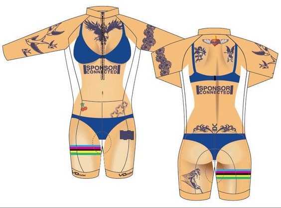
I vote for the third design - love the tats 
-
barton bourassa
- Posts: 1141
- Joined: Fri Nov 09, 2007 10:16 am
Re: Kit Design Ideas - WE NEED YOU!!!!
To no one's surprise I am sure, my submission to the new kit design is the old kit design, the baby blue and pink and yellow and white.
Just look at these handsome gentlemen!
download/file.php?id=1823&t=1
The kit looks marvelous no matter your gender!
It is amazingly visible. It is very distinct. And I really like looking like an Easter egg on a bicycle! And it is easy to clean! Meets all three of Neil's criteria.
Barton.
Just look at these handsome gentlemen!
download/file.php?id=1823&t=1
The kit looks marvelous no matter your gender!
It is amazingly visible. It is very distinct. And I really like looking like an Easter egg on a bicycle! And it is easy to clean! Meets all three of Neil's criteria.
Barton.
Barton Bourassa
Re: Kit Design Ideas - WE NEED YOU!!!!
As they're more relevant here, I'm reposting I a few choice forum threads from before and after the introduction of our last kit redesign in 2012:
The initial invitation for comment and preferences (including Seussian doggerel.)
The big reveal of the new kit—and its fallout.
I've thought long and hard about it (c. 22 seconds), and I can't really figure out the rationale behind your third criteria, Neil:
Or did you mean "darker in general" because dark coloured fabrics show dirt less, can remain undetectably stained after washing, and ergo are easy-cleaning?
The initial invitation for comment and preferences (including Seussian doggerel.)
The big reveal of the new kit—and its fallout.
I've thought long and hard about it (c. 22 seconds), and I can't really figure out the rationale behind your third criteria, Neil:
By "darker", do you mean "darker than the back"? But doesn't the back of your kit get more dirt and crap than your front? No, wait, that's when one rides CX/MTB and not when one is sucking dirt-spumes off a road wheel inches in front...3. The front has to be darker for ease of cleaning.
Or did you mean "darker in general" because dark coloured fabrics show dirt less, can remain undetectably stained after washing, and ergo are easy-cleaning?
Re: Kit Design Ideas - WE NEED YOU!!!!
With the recent supply issues around quality lycra, perhaps it's time to consider a (conceptually appropriate) switch to burlap. Durable, breathable, comparatively inexpensive and sexy as f***.
Re: Kit Design Ideas - WE NEED YOU!!!!
Rolf, the front of your kit also gets really dirty when one is in a CX race. See attached evidence from Sunday.Rolf wrote:
I've thought long and hard about it (c. 22 seconds), and I can't really figure out the rationale behind your third criteria, Neil:By "darker", do you mean "darker than the back"? But doesn't the back of your kit get more dirt and crap than your front? No, wait, that's when one rides CX/MTB and not when one is sucking dirt-spumes off a road wheel inches in front...3. The front has to be darker for ease of cleaning.
Or did you mean "darker in general" because dark coloured fabrics show dirt less, can remain undetectably stained after washing, and ergo are easy-cleaning?
Re: Kit Design Ideas - WE NEED YOU!!!!
Hi Fozzy. Thanks for initiating this topic and for opening this can of worms to our membership. I know there are some creative and design-savvy folks out there who I hope are scheming up some delightfully coffee-themed ideas that everyone is sure to agree on (!).
I mainly wanted to bump this topic back into the club consciousness in the hopes that it will remind people that Fozzy has set a deadline of end of November (that's only two weeks away!) for actual, serious kit design ideas that lots of people would like to wear. (The burlap and fake nudity are, er... funny, but I'm pretty sure we can try harder.)
I count myself among those who would love to come up with a good good idea or two to throw in the mix... I just need to allot a bit of time and creative energy in the next two weeks to do so.
And I'm determined not to be dissuaded by the spirited debates of the past - which Rolf has linked to above - intimidating as they are. I mean, those people have aged and mellowed in the intervening five years so I'm sure far less mud will be slung this time around.
Re: Kit Design Ideas - WE NEED YOU!!!!
That is uncharacteristically conciliatory and optimistic of you, Clarie.Clarie wrote:I'm determined not to be dissuaded by the spirited debates of the past ... I'm sure far less mud will be slung this time around.
Personally, I'll wear anything that says Tripleshot on it. We're not the BC Club of the Year for nothin'!
And it's not the sausage casing that matters; it's the ground-up, delicately-herbed, delicious, greasy filling that counts.
- leftcoaster
- Posts: 577
- Joined: Mon Sep 28, 2009 9:12 pm
Re: Kit Design Ideas - WE NEED YOU!!!!
Just need to add the three coffee cups.......and make the lettering for Tripleshot Cycling a little bolder......
Last edited by leftcoaster on Sat Nov 18, 2017 10:52 am, edited 5 times in total.
Re: Kit Design Ideas - WE NEED YOU!!!!
I like Kevin L.'s suggestion. The colours could be selected so that Barton's favourite kit could go with it - i.e., one could wear the new jersey with baby blue shorts/bib-shorts. Not necessary, but an idea. Also, we could ask for sprinter, climber, and GC versions. For example, the person in the club that does best in the VCL hill climbs in 2018 wins one with red squares, the person in the club that wins the most Windsor Park and Speedway sprints wins one with green squares. Highest points in VCL at the end of the year wins a yellow square version.
Here's one from the web that similar. Just shows that square size can make a big difference.
http://img.mensjournal.com/social/mj-61 ... to-buy.jpg
JT
Here's one from the web that similar. Just shows that square size can make a big difference.
http://img.mensjournal.com/social/mj-61 ... to-buy.jpg
JT
Re: Kit Design Ideas - WE NEED YOU!!!!
Can we voice opinions on the choices so far???? Is that kind of input desired?
Re: Kit Design Ideas - WE NEED YOU!!!!
Is there a program to design these?
I have an idea but am currently limited to Crayola Easy-Clean markers and construction paper.
I have an idea but am currently limited to Crayola Easy-Clean markers and construction paper.
- leftcoaster
- Posts: 577
- Joined: Mon Sep 28, 2009 9:12 pm
Re: Kit Design Ideas - WE NEED YOU!!!!
Voice opinions, Louise, and offer suggestions. It’s a give-and-take board...,
David
David
-
norman marcy
- Posts: 322
- Joined: Thu Dec 06, 2007 8:17 pm
Re: Kit Design Ideas - WE NEED YOU!!!!
I seldom agree with Westcoaster Dave, but in a healthy way. So mark this down.
I have to say that I like the kit idea presented above the checker board swirl is real the argil that we have with a spin and the added colour of the red stripe is going to get picked up as a visual by car drivers I would make it a bit brighter and on both legs
dark enough for thos that ride in the dirt and baby blu enough to be visible like the blue beret baby blue of old that I am still fond of.
look forward to comment on others too
if I knew how i would try to put some of my own thoughts on the screen is there a design site that is easy to use??
norman
- leftcoaster
- Posts: 577
- Joined: Mon Sep 28, 2009 9:12 pm
Re: Kit Design Ideas - WE NEED YOU!!!!
Thanks for the input Norm
I’m trying to be make it visible, yet tie into our history a bit.
I’m trying to be make it visible, yet tie into our history a bit.
Last edited by leftcoaster on Thu Nov 23, 2017 3:07 pm, edited 1 time in total.
Re: Kit Design Ideas - WE NEED YOU!!!!
Okay then. I like Leftcoaster's design. I like the asymmetry, like the colors. Its a bit of a nod to the older Team Canada kit. I like the splash of red. I find the straight check a bit staid.